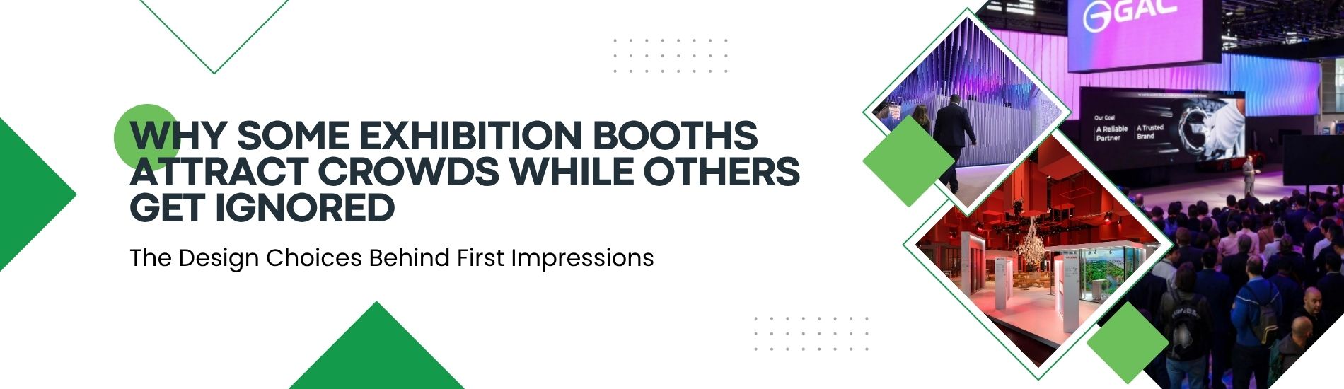
Why Some Exhibition Booths Attract Crowds While Others Get Ignored
Why Some Exhibition Booths Attract Crowds While Others Get Ignored
Walk the floor of any major trade show and the pattern is obvious within minutes. A handful of booths are packed with visitors, staff are mid-conversation, and there's a buzz of activity. A few aisles over, an equally well-funded stand sits half-empty, its team checking their phones while attendees walk straight past.
The difference rarely comes down to budget. It comes down to a set of design and engagement decisions that either invite people in or give them a reason to keep walking. Research consistently shows that attendees decide whether to stop at a booth within three to five seconds of seeing it. That's not enough time to read a paragraph of copy or notice a subtle brand detail — it's enough time to register a shape, a colour, and a feeling. Everything that happens after that first glance either confirms the decision to stop or reinforces the decision to walk on.
The Three-Second Window That Decides Everything
Before a visitor evaluates your product or your pitch, they evaluate your booth's "Image Quotient" — a snap judgment built from visual clarity, message simplicity, and how approachable your team looks. Booths with a high Image Quotient share three traits: bold, uncluttered visuals; a message that's readable at a glance; and staff who look engaged rather than idle.
Booths that get ignored usually fail on one of these fronts. Either the graphics are too text-heavy to process quickly, the value proposition is buried under a clever tagline nobody has time to decode, or the staff are seated, distracted, or clustered together in a way that signals "don't interrupt us."
Visual Design That Cuts Through the Noise
An exhibition hall is a visually saturated environment — dozens of competing stands, moving crowds, overhead signage, and ambient noise. To register at all, a booth needs strong visual contrast: large-format graphics rather than dense photo collages, a consistent colour palette that's visible from the aisle, and lighting that draws the eye toward the stand rather than leaving it in the shadow of a neighbouring build.
Open sightlines matter just as much as the graphics themselves. A booth with high walls, closed counters, or furniture blocking the entrance creates a subconscious barrier. Visitors read a closed layout as "not for browsing," even if that was never the intention. The most-visited stands tend to have unobstructed entry points from at least two sides of the aisle, so visitors can step in without committing to a full conversation.
Messaging People Can Actually Read at a Glance
Text is often the first thing exhibitors get wrong. A headline crammed with product specifications or corporate jargon asks too much of a passer-by who's making a decision in a few seconds. The booths that consistently pull traffic use short, benefit-led messaging — a single clear statement of what the company does and why it matters, placed where it's legible from several metres away, with supporting detail reserved for conversations once someone has stopped.
Give Visitors Something to Do, Not Just Something to Read
Passive booths — a backdrop, a counter, a stack of brochures — rely entirely on staff to generate interest. Interactive booths do some of that work automatically. Industry research from the Center for Exhibition Industry Research found that the majority of attendees rate hands-on demonstrations and interactive experiences as the most useful way to evaluate a product or solution, ahead of static displays or presentations. A live demo station, a touchscreen configurator, or a simple product-in-use setup gives visitors a reason to linger — and lingering visitors are far more visible to other attendees, which creates the social proof that pulls even more people in.
That social effect is worth designing for deliberately. A booth with visible activity signals to the rest of the hall that something here is worth stopping for. An empty booth signals the opposite, regardless of how much was spent on the build.
Staff Presence Is Part of the Design
Even the best-designed stand underperforms if the team staffing it isn't actively engaging. Crossed arms, phones out, or staff facing inward toward each other rather than outward toward the aisle are small signals that add up to a closed impression. Teams that consistently draw traffic tend to stand near the front edge of the stand, make eye contact with passers-by, and open conversations with a question rather than a rehearsed pitch — inviting engagement rather than demanding attention.
Common Mistakes That Quietly Repel Visitors
A few recurring issues show up again and again on underperforming stands:
- Overloading graphics with text or a logo that dominates over the message
- Enclosed layouts with high walls or furniture blocking natural entry points
- Messaging that describes the company rather than the visitor's problem
- No interactive element to justify stopping for more than a few seconds
- Staff who are present but not actively engaging with the aisle
None of these are expensive fixes. They're design and behavioural choices that can be corrected before the next show without reworking the entire stand.
Turning First Impressions Into Real Engagement
Attracting a crowd isn't about being the loudest or the biggest stand on the floor. It's about giving people a fast, clear reason to stop, and then making the experience worth the time they've given you. Open layouts, legible messaging, an interactive moment, and a genuinely engaged team consistently outperform bigger budgets spent without that thinking behind them.
At Fountainhead International B.V. booth design is approached with exactly this in mind — building stands that are engineered to earn attention within seconds and hold it once visitors step in. If your next exhibition stand needs to work harder for you on the show floor, our design team can help you get there.
Latest Blogs

© Copyright by FOUNTAINHEAD INTERNATIONAL B.V. || Designed and maintained by S2code